It’s funny how things work out sometimes. A couple of months ago I was part of a Twitter convo about finance apps/platforms for New Zealanders – and although it wasn’t yet available to us, Simply Wall St came up. And what do you know … just the other week I received an email informing me of their NZ launch and inviting me to try it!
Simply Wall St is one of the new breed of fintech companies making stuff simple and visual. Essentially, it’s designed to help you understand how publicly listed companies are performing in order to make better investment decisions. Is a business undervalued or overvalued? In a solid financial position? What might you expect in terms of future earnings and dividends? Simply Wall St can offer some insights to help you reach a conclusion on questions like these. There is lots of delicious data to feast on, served up in an accessible and digestible way.
For NZ investors, Simply Wall St links up with Sharesight, which is handy. This integration didn’t actually do much for me as I only invest in funds (not individual stocks). After connecting my Sharesight and Simply Wall St accounts, only one of my Sharesight-tracked funds was in the Simply Wall St database but as it’s comprised of ETFs Simply Wall St couldn’t provide much analysis on it.
That said, one of the two example portfolios served up to me was the Harbour Australasian Equity Fund, which invests in local companies and that I actually have a small holding in!
Here’s what Simply Wall St had to tell me me about the fund:

Value
A look at the value of the portfolio based on price relative to market and future cash flows – are you paying a fair price? Looks at metrics like PE, PB and PEG ratios.

Future performance
A look at average expected growth in earnings.

Past performance
A look at metrics like Return on Equity, Return on Capital and Return on Assets over the past 5 financial years.

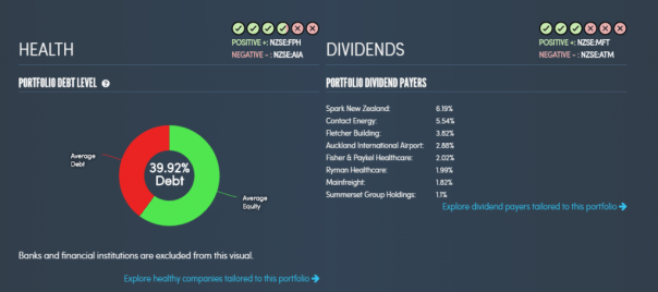
Financial Health / Dividends
A look at debt levels and the stability of the company.
All of this gets distilled into one neat overview graph: The Snowflake. You can see it below – top right and in the left hand nav too. It’s a visual summary of the areas described above. The shape and colour of the snowflake is meant to give you a snapshot reading and enable easy comparison against other investments.

I was also able to see an overview of the individual companies this fund holds.
 Plus, you can use Simply Wall St to find new investment ideas. For example, you might mine the database for stocks that are potentially undervalued, stocks with room to grow, or for stocks in certain industries. Grid views serve you up collections based on criteria you set.

I’m definitely a hands-off investor. That said, if that were to change, I would absolutely want Simply Wall St on my side – I can imagine making full use of it to research companies and guide my decisions.
Are you a more active investor than I am? Keen to try Simply Wall St for yourself? Sign up for a free trial here.


Wow, looks like a great tool. Thanks